Some of the most exciting digital projects in the Triangle are a result of student work. Many student digital projects have been created through Duke University’s Data+ summer program in collaboration with research teams on the campus, like the Bernhardt Lab, that helped create the Ecological Data Visualization project in 2017.
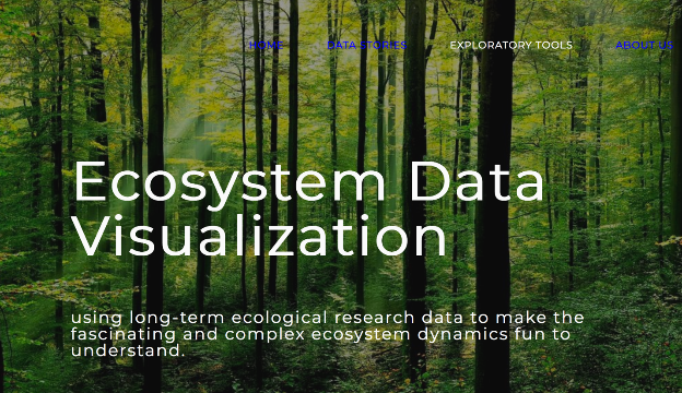
The Ecological Data Visualization website displays data from the Hubbard Brook precipitation and stream chemistry record, started in 1963 by Dr. Gene Likens. This huge set of data was used by the Bernhardt lab to provide easy-to-understand data stories and visualizations of the ecological data collected about watersheds. The research team ranges from undergraduates to faculty members, and their diversity of fields and experience shows through in a thorough early-version project. And they’ve hit all the highlights of digital humanities: visualizing complex information, telling a story with data, using a diverse set of interdisciplinary skills, and making their content open-source (check it out on GitHub).
Their website sends out a call for comments or suggestions about the website and project. Take a look and submit your feedback to richard.marinos@duke.edu! If you want to help but don’t know where to start, you can use these guided questions to help you think about ways to improve the interface:
Web Structure
- How intuitive is the interface?
- Are there any broken links, filler text, etc. still on the page?
- How many clicks would it take to get to specific data set a user was looking for? To find the source material information? To find information about the project?
- Is all the text legible?
- Is the page accessible to screen readers, large print, or mobile versions?
Content
- Would the information make sense to a non-expert/layperson?
- Are all necessary factors included in each visualization?
- Are the research and collection methods described?
Data Visualization
- How clearly is the data displayed?
- Does it make sense in the format chosen? Would another graph or chart be more applicable?
- Are the filters appropriate for the data? Do the filters deepen understanding?